
The Magpie's Tale
A website for an independent bookshop in Churchtown, Southport, drawn by one of its owners. Mark's pen drawings carry every page, the owners edit it themselves, and it's rated A+ for carbon.

- Type of work
- Brand and web design
- Year
- 2026
- Client
- The Magpie's Tale
- What we did
- designdevelopmentbrandinglow carboncms
What came of it
- Carbon rating A+: 0.034 g of CO₂e a visit, cleaner than 96% of pages tested, on verified green hosting
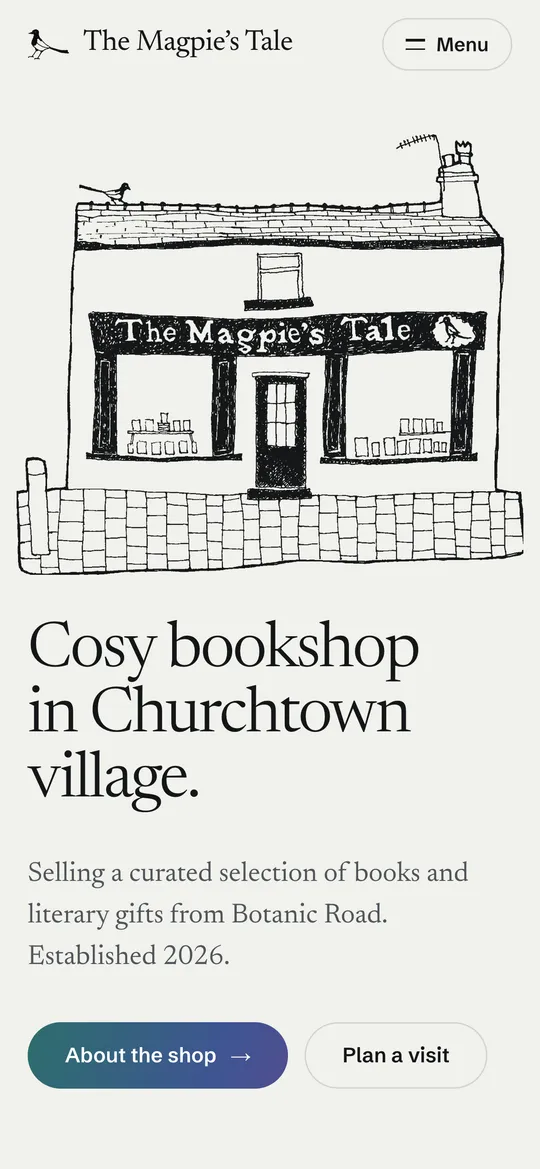
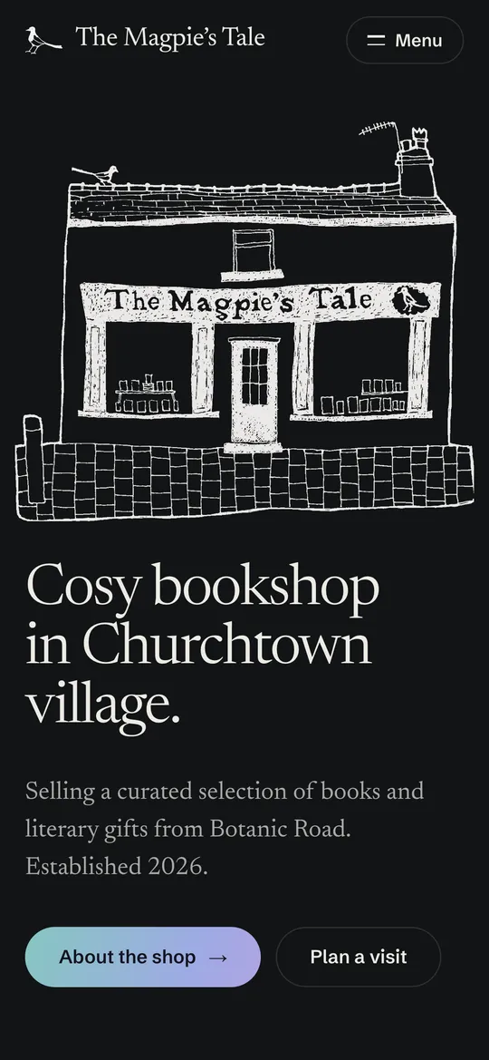
- Every picture on the site is Mark's own pen drawing, 17 to 65 KB each, turning to chalk in dark mode
- Emma and Mark edit every event, book, picture and opening hour themselves, with no database and no plugins
The Magpie’s Tale is an independent bookshop on Botanic Road, in historic Churchtown village in Southport. Emma and Mark opened it in 2026, and Sam, their cocker spaniel, is often curled up behind the counter. OakFox made the brand and the website, and hosts it.
The Problem
A new bookshop has one thing a chain can’t copy: the people who run it. Most small shop websites hide that behind stock photos of books and a template that could belong to anyone. The shop also needed a site the owners could keep current themselves, because events, new arrivals and opening hours change every week and nobody wants to email a developer to change a date.
The Brief
Make the site feel like walking into the shop. Show the books Emma and Mark chose, the events worth turning up to, and how to find the door. Let them edit all of it without help. And keep it light: a shop that sells paper books shouldn’t need a heavy website to do it.
The Solution
Mark’s drawings do the work
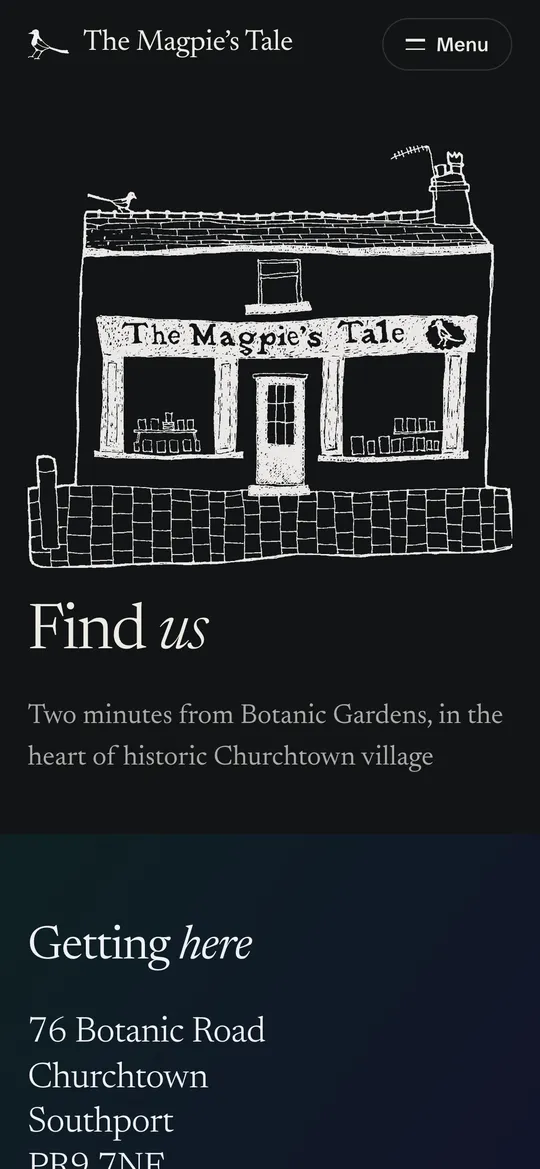
Mark drew the shopfront in pen. It’s the one picture no other bookshop could use, so it leads the homepage instead of a photo of books. The magpie in the logo is traced from Mark’s drawing of a standing magpie rather than redrawn, and the wobble in the line is left in on purpose.
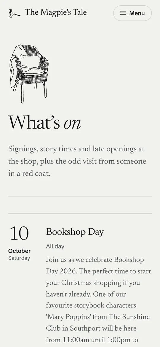
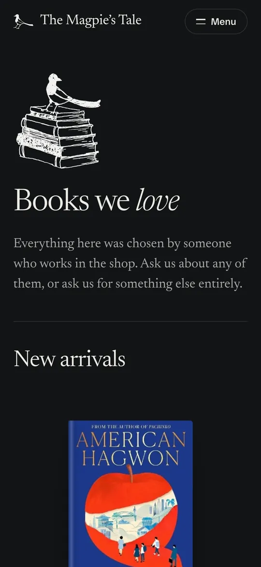
Every other picture on the site is Mark’s too: the wicker armchair beside What’s On, the open door that welcomes you in, two magpies on a branch for the team, the Churchtown street on the way to the shop, and a magpie on a pile of books asking if you can’t find the one you’re after. Each was photographed, cleaned into ink on a transparent background with a small script we wrote for it, and saved as WebP. They weigh 17 to 65 KB each.
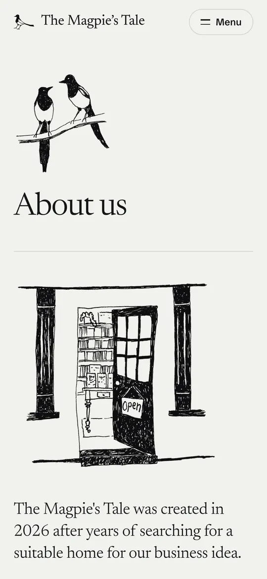
Ink by day, chalk by night
If a visitor’s phone is set to dark mode, the site follows it, and the drawings turn to white chalk on slate. It’s the same image files with one line of CSS that inverts the ink, so dark mode costs nothing to download.
One colour, borrowed from the bird
A magpie looks black and white until the light catches its tail, which flashes green, blue and violet. The site works the same way. It’s ink on paper, apart from a teal-to-violet shimmer that marks the things you can press. On hover, the shimmer slides across the button like light moving over a feather. The one dark band on the page, where you find the shop, uses the same colours.
Keeping the colour this rare is practical as well as pretty. A signwriter or a printer can match black and white exactly, in one colour, for very little. The shimmer is the one thing they can’t, so it stays special.
Colour Palette
- Paper (#F1F1EC) - the background: a warm off-white, like a page rather than a screen.
- Ink (#141618) - words and drawings.
- Magpie shimmer (#2D6E6C → #3E5592 → #5C4A8E) - teal to blue to violet, used for buttons and nothing else.
- Night (#181D36) - the deep blue-violet behind “Come and find us”, the one block of colour on the page.
Typography
Newsreader carries everything the shop says: headlines, book notes, the team’s words. It’s a serif made for reading on screens, and its optical sizes mean the big headlines get a finer display cut while the body text gets a sturdier one, both from the same file. Schibsted Grotesk carries the furniture, such as dates, prices, opening hours and buttons. An all-serif site read like a pamphlet; giving the practical details their own plain voice keeps them quick to scan. Both fonts are hosted on the shop’s own server, so no visitor details go to Google Fonts.
One simple rule keeps the shapes consistent. Anything you can press is a pill, anything that holds content has a small rounded corner, and drawings have no frame at all.
Key Features
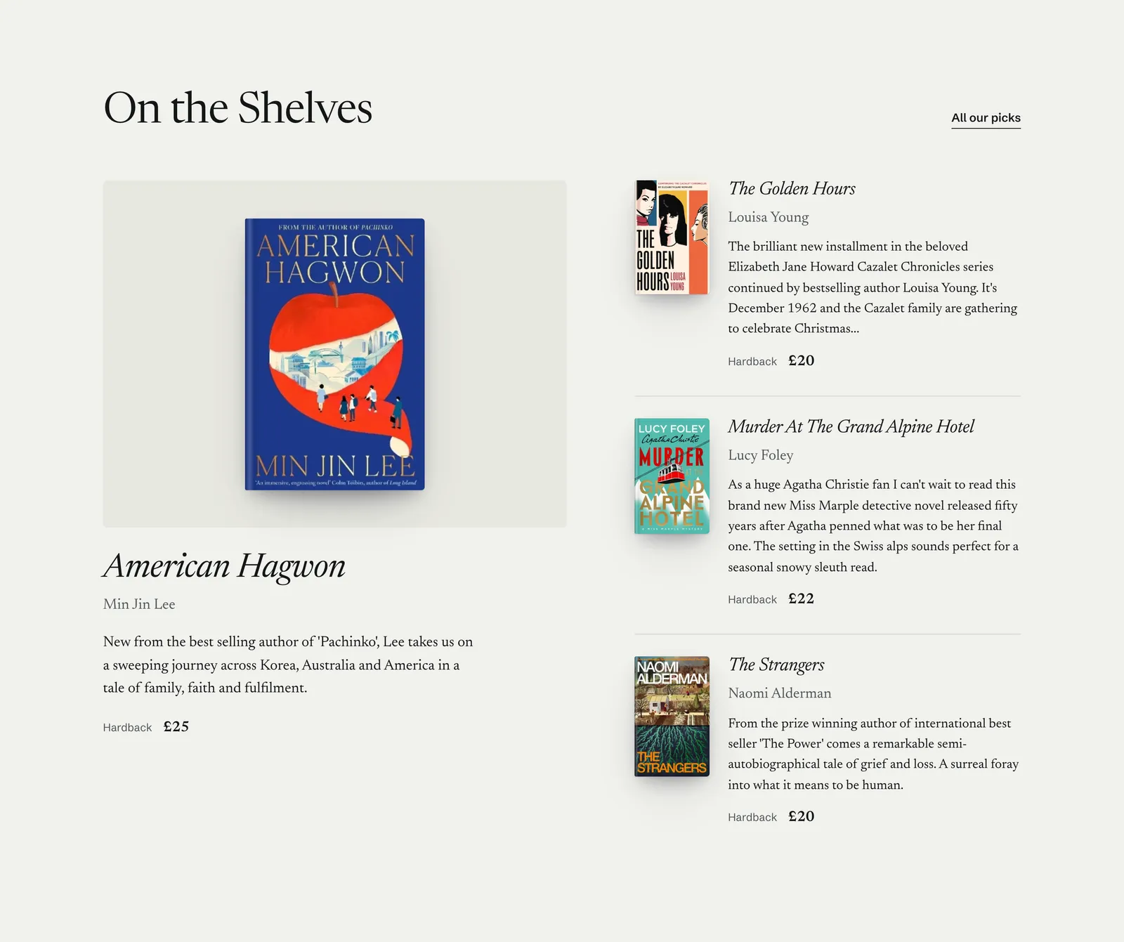
- Shelf cards, not product tiles - each book is set like the card on the shelf: title in italic, a note from whoever read it, the format and the price. No star ratings and no “you may also like”.
- What’s On, date first - events lead with the day, and “Register interest” opens the shop’s own contact form with the event already filled in.
- Can’t see the book you’re after? - every page ends by offering to order any book in for collection. It’s the thing a local shop can do that a warehouse can’t.
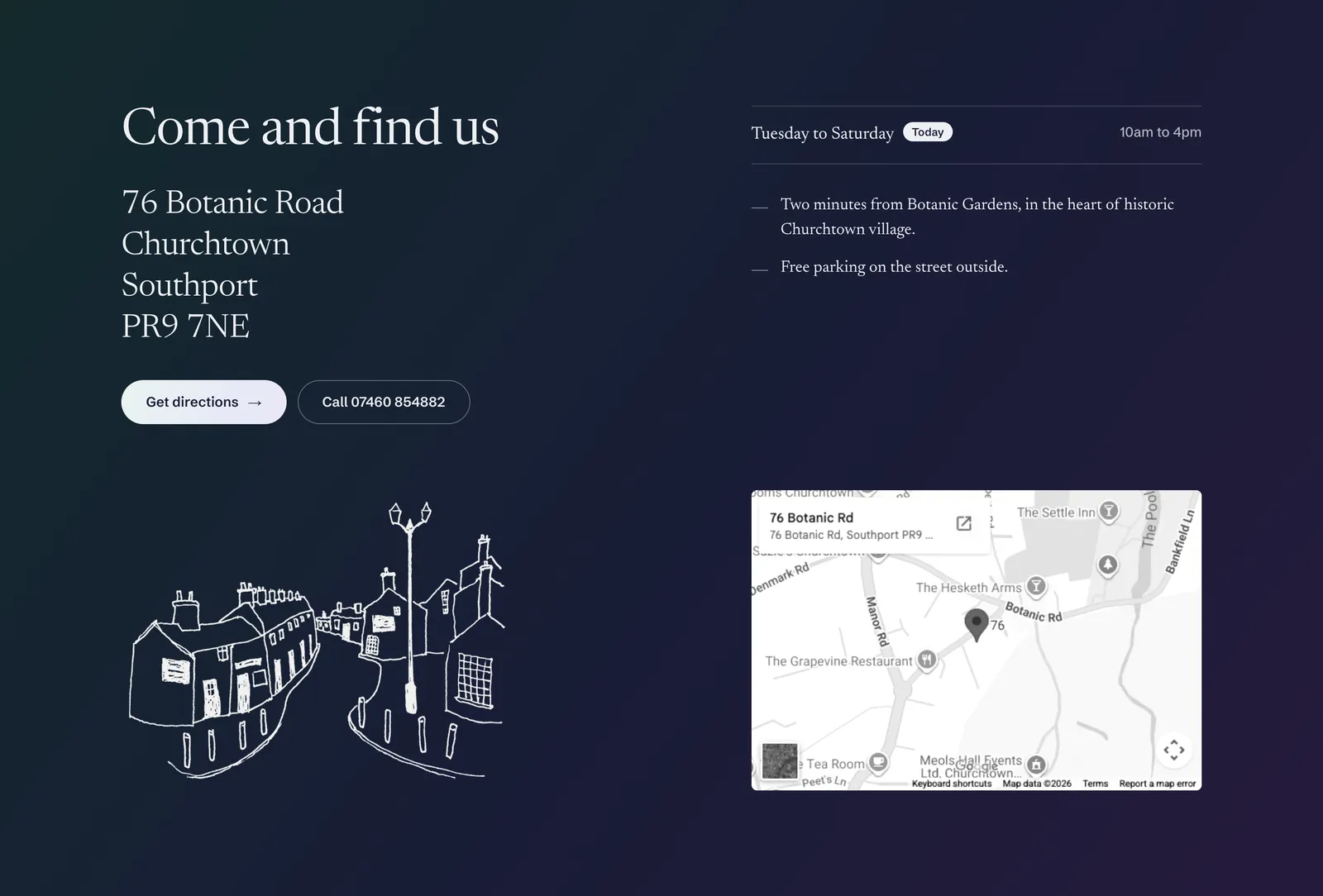
- Come and find us - address, tap-to-call, directions and the week’s opening hours, with today’s marked, next to Mark’s sketch of the street and a map.
- Their own admin - Emma and Mark each have a login and edit events, books, covers, the team, opening hours, homepage sections and page pictures themselves. Uploads are resized and converted to WebP automatically, so a photo straight off a phone can’t make the site heavy.
- No database, no plugins - content is stored as small files on the server, so there are no plugins to keep updated and very little to go wrong.
Low Carbon, Measured
Every visit to a website uses electricity: in the data centre, across the network and on the visitor’s phone. The more a page downloads, the more it uses. We ran themagpiestale.com through our own Website Carbon Audit, which measures what a first-time visitor downloads and estimates emissions with the Sustainable Web Design Model.
Carbon audit · 6 October 2026
- Per visit
- 0.034 g
- of CO₂e
- Page weight
- 272 KB
- in 10 requests
- Cleaner than
- 96%
- of pages tested
- Hosting
- Green
- verified by The Green Web Foundation
Where the 272 KB goes
- Fonts 222 KB
- Images 37 KB
- CSS 7 KB
- HTML 5 KB
- JavaScript 2 KB
For comparison, the median homepage in our study of 99 UK small business websites weighed 1.8 MB and produced 0.238 g a visit. Only 18 of the 99 rated A or better. The Magpie’s Tale homepage is about a sixth of that weight, with about a seventh of the emissions.
Most of that comes from what the site leaves out:
- Drawings instead of photographs. The shopfront drawing at the top of the homepage is 26 KB, a fraction of a typical phone photo. The drawings and book covers further down only load as you scroll to them.
- No tracking, adverts or chat widgets. Everything on a first visit comes from the shop’s own server. The Google map near the bottom only loads if you scroll down to it.
- 2 KB of JavaScript. It runs the menu, the contact form and the way sections fade in, and nothing else.
- Verified green hosting. The site runs on OakFox’s own server, with a host The Green Web Foundation verifies as green.
From A to A+, without changing the design
The site launched at A: 422 KB and 0.052 g a visit. Three quarters of that was type, because the finished design uses Newsreader’s optical sizes for the headlines and a second family for the practical details. We didn’t want to give either up, so we made the same design lighter instead:
- Compression. The server now compresses the page, the stylesheet, the scripts and the SVG magpies before sending them, which shrinks them by about two thirds. It was switched off by default.
- Fonts split in two. Each font now comes as a core file, holding the letters and punctuation the shop actually uses, and a second file of accented letters and rarer symbols. A browser only fetches the second file on a page that needs it, and none does yet. The letters themselves are untouched, and we compared every page before and after, pixel for pixel, in light and dark mode on a phone and a desktop.
Together they took the homepage from 422 KB to 272 KB and the rating from A to A+, and nothing a visitor sees changed. The audit link above re-measures the live site every time, so the grade always reflects the site as it is now, whatever the shop adds.
What We Delivered
- Brand identity built from Mark’s drawings: logo, colour, type, tone of voice and guidelines
- Website design and development, for phones first, with a dark mode
- Mark’s pen drawings cleaned and prepared for the web
- A self-service admin with a login for each owner: events, books, team, hours, homepage sections and pictures
- A contact form that sends from the shop’s own address, protected from spam
- Hosting on OakFox’s green server, with the move to themagpiestale.com and its email records
- Carbon tuning after launch, from A to A+ with no visible change
Visit The Magpie’s Tale · Run the carbon audit on it · Find them on Instagram

