
Building CubTrack: Designing a Calm Baby Tracking App for UK Parents
CubTrack is a baby tracking app we designed, built, and launched ourselves. Brand identity, UX, Android app, marketing site, freemium pricing, store listing — every layer. It’s now live on the Google Play Store, with iOS in development.
This post is the inside view. Why we built another tracker when the category is already crowded. The decisions that shaped the app. What we got right, what we’d revisit, and what’s worth knowing if you’re commissioning or building a mobile product yourself.
Why Another Baby Tracking App
The “baby tracking app” search results in the UK are dominated by two kinds of product. The first is the bloated, gamified app — feature-stacked, ad-supported, and visually exhausting. The second is the legacy app that hasn’t seen a UI refresh since iOS 9, with three-star reviews and abandoned roadmaps. Neither is what tired parents need at 3am.
The unmet brief was specific: a calm, modern app that logs feeds, naps, nappies, and milestones quickly, syncs across caregivers in real time, and never gets in the way. The category was crowded but the gap was real.
We also had a strategic reason to build it. OakFox does brand, web, and consultancy work for clients — but shipping our own product gives us a place to test technical and design decisions end-to-end, without compromise. CubTrack is the studio’s first long-form product project, and the work has fed back into how we now approach client mobile briefs.
The Problem in One Sentence
A first-time parent or shared caregiver group needs to log small events dozens of times a day — feeds, sleeps, nappies, medications, temperatures — and have everyone in the household see the same picture without phoning each other or scrolling a group chat.
Existing solutions:
- Memory. Fails by week two.
- Group chat. No structure, no patterns, no exportable history.
- Spreadsheets. Work, but only for the parent who set them up.
- Existing apps. Either too noisy, too dated, or paywalled past the point of useful.
CubTrack’s job is to be the answer that obviously fits the question, especially for parents with shared caregivers — partners, grandparents, nannies, childminders — who need the same view of the day.
Brand First, Not Last
We designed the brand before writing a single line of app code. That order matters. A brand sets the constraints that everything downstream — colour, type, density, tone — has to respect. Build the app first and the brand becomes a reskin job that never quite fits.
The brand brief was one word: calm. Every subsequent decision had to be defensible against it.
- Soft Sage as the primary colour — calming, gender-neutral, away from the pink/blue trap most baby apps fall into.
- Warm Cream as the dominant background — softer than white, easier on tired eyes, especially under low-light conditions.
- Forest Green for emphasis and headings — adds authority without shouting.
- Charcoal, not pure black, for body text — reduces eye strain during night feeds.
These look like small choices in isolation. Together they’re the difference between an app that lowers cognitive load and one that adds to it.
Designing for 3am
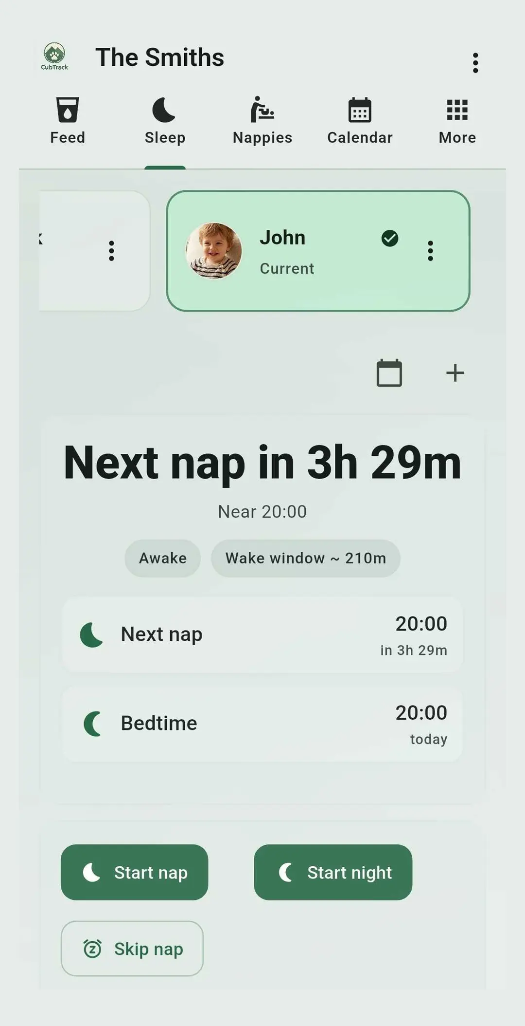
The hardest UX constraint in a baby tracking app is the operator’s state. The user is often half asleep, holding a baby, with one hand free, in low light. Every screen had to assume that.
What this meant in practice:
- Single-tap logging on the home screen. No drilling into a category and then a subcategory to record a nappy change. The most common actions are surfaced first, ranked by usage frequency.
- Larger touch targets than typical Material Design defaults — at least 56dp, often more — because shaky-handed taps misfire constantly.
- High contrast type, low density screens. Empty space is functional. Cramming screens with information is a default that feels efficient at design time and brutal at 3am.
- No dark patterns around upgrade prompts. The free tier has to be genuinely usable on its own. Pro features unlock convenience, not core function.
- Reversible logging. Mistaps happen. Every log can be undone or edited from the timeline without a deep menu dive.
These aren’t novel principles — they’re standard mobile UX best practice — but the discipline required to consistently apply them across 30+ screens is where most consumer apps fall apart. The rule we set: if an interaction needs more than one decision from a sleep-deprived user, it’s not done yet.
The Android Decision
We launched on Android first. Three reasons:
- UK market share. Android holds roughly 50–55% of the UK smartphone market, depending on the quarter and the source. Launching iOS-first leaves half the country waiting.
- Faster review and iteration. Google Play’s review cycle is typically hours, not days. For an early-stage product where we expected to ship updates weekly, that mattered.
- Lower indie publishing friction. The Play Console developer onboarding is more forgiving for small studios than Apple’s Developer Program, especially around testing tracks and staged rollouts.
iOS is now in active development and will follow within the next major release window. The codebase decisions we made up front — clean separation of UI from business logic, platform-agnostic data models — were shaped by knowing iOS was coming.
Real-Time Sync Across Caregivers
The single feature that drives the most retention in our usage data is the shared timeline. Two parents, a grandparent, and a childminder can all be looking at the same baby’s day and see logs as they happen.
This is harder to build than it sounds. The naïve approach — sync on app open — produces the experience users actually have with most existing trackers: open the app, see stale data, log a feed, hope your partner sees it before they get home. We instead invested in proper real-time sync from day one. The result is the kind of “it just works” experience that parents only notice when it doesn’t.
Lesson for product owners: sync is not a feature to retrofit. If multi-user, multi-device is in scope at all, build for it from the first sprint.
Marketing Site and Store Listing
The marketing site at cubtrack.co.uk was built alongside the app, not after. Same brand system, same tone of voice, same colour palette. Visitors arriving from a Play Store listing should feel they’re still in the same world.
A few decisions that paid off:
- One screenshot per scroll-section, not a grid of nine. The Play Store listing already has the gallery; the marketing site has space to slow down.
- Pricing on the homepage, not buried. Free and £4.79/month for Pro, stated clearly. Hidden pricing trains users to expect dark patterns later.
- A direct Play Store CTA above the fold — no email-capture wall, no “join our waitlist” — because the app is shipping, not pre-launch.
Store listing optimisation is a separate craft. We focused on three things: a clear primary screenshot showing the home dashboard, a short feature graphic that reads at thumbnail size, and a description that opens with the use case (“Track every feed, nap, nappy and more — without losing your mind”) rather than a feature list.
Pricing as a Product Decision
Freemium is the only model that works for a daily-use family app where the alternative is a free Google Sheet. The decisions:
- Free tier covers everything an individual parent realistically needs. Feeds, naps, nappies, growth, milestones — all unlocked.
- Pro (£4.79/month) unlocks shared caregivers, unlimited custom trackers, PDF exports, and cloud backup. The features that matter most to households with multiple people involved.
- No ads. Ever. An app that opens forty times a day at 3am should not be running display ads. The opportunity cost of ad revenue is paid back in trust.
Whether £4.79 is the right number is something we’ll keep testing. The point is to set it deliberately, monitor conversion, and adjust — not to anchor to whatever competitors are charging.
What’s Next
The current roadmap covers three things:
- iOS launch — in active development, with the same brand and feature parity from day one.
- Pro features — expressed milk stash management, expanded custom trackers, deeper export options for parents managing GP appointments.
- A small B2B layer for childminders and nurseries who already use CubTrack informally with parents.
We’re also using CubTrack as a working laboratory for the studio. Decisions that prove out in our own product — design system architecture, sync infrastructure, store listing approach — feed back into how we approach client briefs around mobile, web apps, and product launches.
Try CubTrack, Or Build Your Own
If you’ve got a baby or toddler in the house, CubTrack is free to try on Google Play:
Download CubTrack on Google Play — or read more at cubtrack.co.uk.
If you’re a founder or product team thinking about building a mobile app — for the UK market or further afield — and you want a partner who can take you from brand through to store listing in one engagement, send us a few lines. We reply within 24 hours.